For Change Co.

project overview
project overview
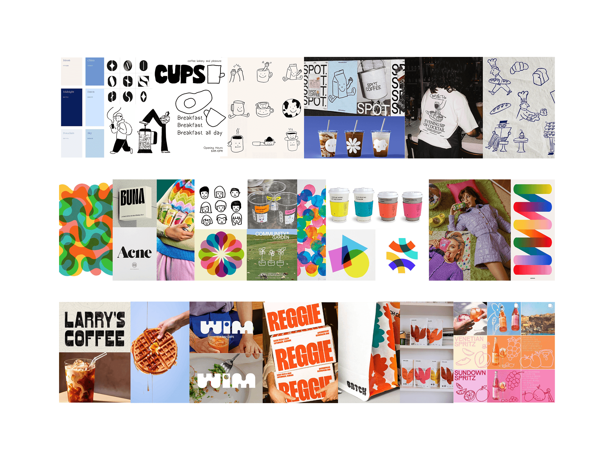
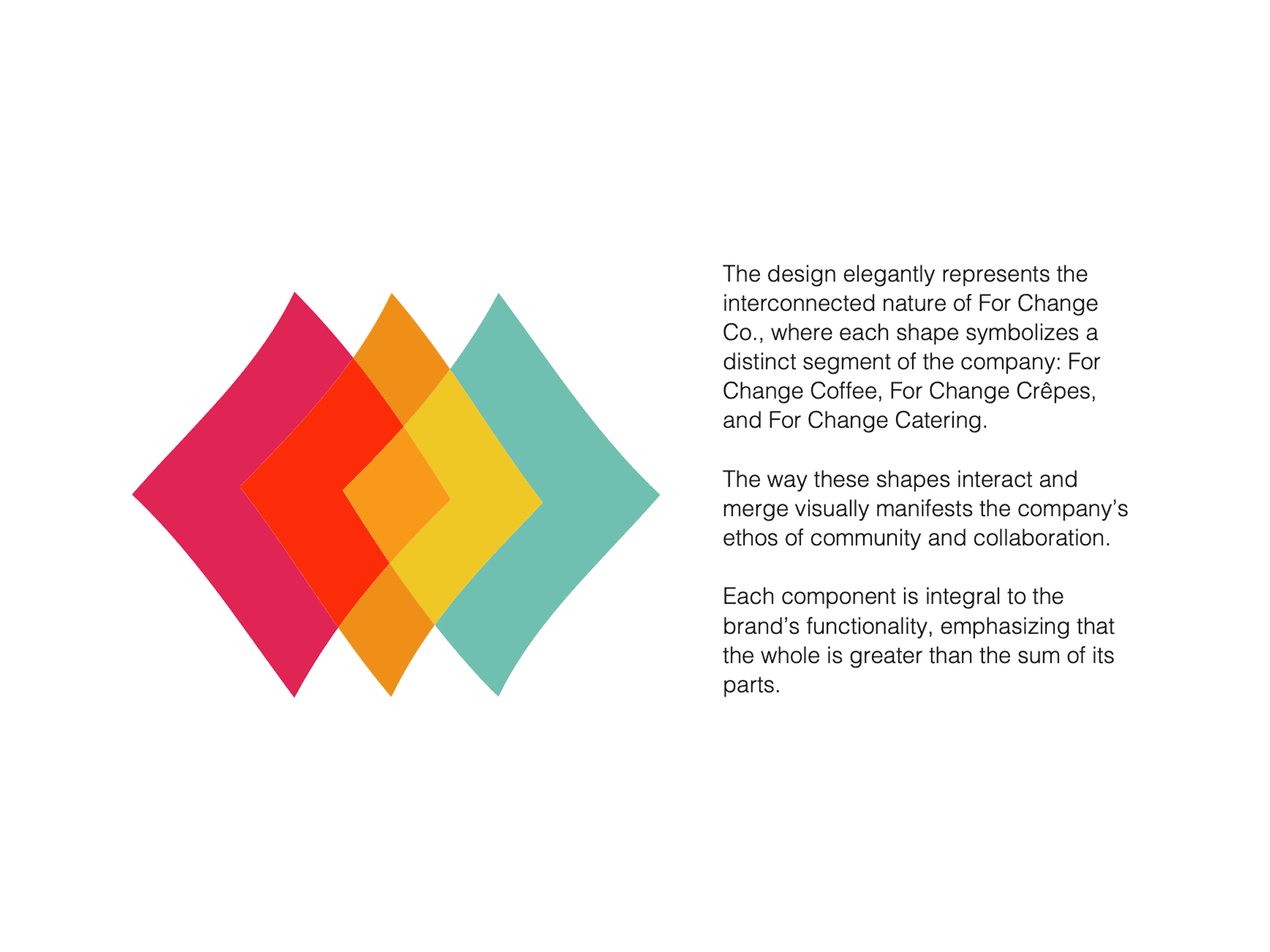
Driven by strategy and rooted in social impact, ‘Harmony in Action’ is a visual celebration of community collaboration. The system uses a dynamic convergence of interlocking shapes and warm, retro-contemporary hues to signify diverse entities moving toward a common goal. By establishing a unified design language across all sub-brands, this reimagined identity elevates For Change Co.’s presence—ensuring their mission to combat youth homelessness is clearly articulated through every color, illustration, and visual layout.
project type
project type
Rebranding
Rebranding
year
year
2024
2024
my role
my role
Student Designer
Student Designer
client
client
University of Melbourne